
Enervee brand guidelines
Clear.Confident.Trustworthy.
Logos, the Enervee Score, Eco Financing marks, color, type and the rules that hold them together. Every asset downloads from this page.

Logo
Primary logo
Our logo is the primary identifier for our brand. It combines the nudge with our name, carefully kerned in Instrument Sans. Use it whenever space allows.
Clear space
Do not crowd the logo. When placing other elements around it, keep a margin of at least x on every side, where x is the height of the capital E in the wordmark. Minimum width: 96px on screen, 25mm in print.
Usage
The logo is black on light backgrounds and white on black or a brand color. It is never recolored, outlined, rotated or given effects.
Do — white logo on Lime Green, Dodger Blue or black. Black logo on white or White Smoke.
Don't — recolor, tilt, add gradients, drop shadows or place over busy imagery.
The Nudge
Our mark
Enervee is about nudging customers to more energy-efficient choices. The main visual element of our logo, the nudge, represents the top quartile of efficiency. Enervee owns a registered trademark of its shape.

Imagine efficiency as a scale from 0 to 100 laid out like a clock. The best choices sit in the top quarter, from 9 o'clock to 12. That quarter is the nudge. It is where we aim to put every choice.
Enervee Score®
Score badge
The Score is a 0–100 rating of a product's energy efficiency and a visual primitive of the brand. The badge is always a solid Lime Green disc with the nudge in white and the number centered. The color does not change with the score.
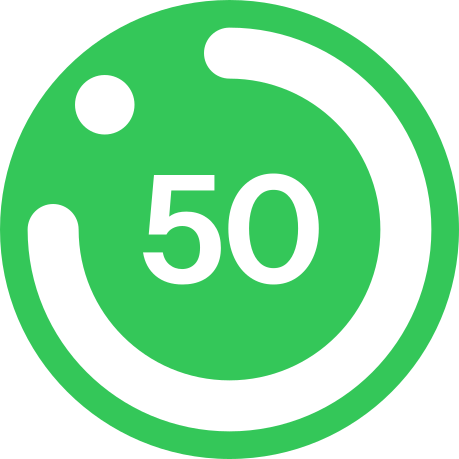

Score badges may only be shown against products that carry a published Enervee Score. Do not alter the number or use the badge to imply a rating that does not exist.
Writing the Score
Write Enervee Score® with the ® on first mention, bare after. The number stands alone: "Enervee Score 92", never "92/100". Bands are verbal only: 0–50 Low, 50–75 Average, 75–90 Good, 90–100 Ideal.
Inline form: "92 · Ideal". Compact pill: "Score • 92" on Lime Green.
Eco Financing
Eco Financing logo
Enervee Eco Financing is the better way to pay for energy-efficient appliances. The lockup pairs the Enervee badge with the Eco Financing mark, whose shape is derived from the universal method of payment: a credit card.



Color
Palette
One palette, weighted two ways. Black carries structure, White Smoke carries the page, and Lime Green is the single accent. Every other bright does one job at a small scale. Always the full color, no tints, no dual-color gradients. Click a swatch to copy its hex.
Ink derivatives
Brights fail contrast as text on light backgrounds, so each has a darker ink for that one use. Inks are text, icons and hairlines only. Never a fill: a green button, chip or band is Black or Lime, not ink.
Lime ink
#166B33 · 7.0:1 on white
Eyebrows, rebate amounts and links on green context. Replaces every former green fill on the site.
Coral ink
#C8253C · 5.6:1 on white
Loss figures and destructive text on light surfaces. Coral itself stays on Black.
Blue ink
#0063DB · 5.5:1 on white
Text links on white and White Smoke. Product buttons hover to #0066D6.
Proportion
On enervee.com, neutrals carry the page and every page has exactly one Black band. Lime is the only bright allowed as a field, and only on Black. Blue is functional (links, focus, product controls); Coral, Cyan and Gold are numerals and lines measured in pixels, not sections.
Typography
Primary typeface
Our brand uses Instrument Sans, a variable sans-serif designed by Rodrigo Fuenzalida with direction from Jordan Egstad. It balances precision with subtle notes of playfulness. Semibold is our headline weight. It is our only typeface: no serif, no second family.
Instrument Sans Semibold
ABCDEFGHIJKLMNOP
QRSTUVWXYZ
abcdefghijklmnopqrst
uvwxyz
0123456789
!@#$%^&*()?+
Weights
Weight provides hierarchy. Regular for body, Medium for UI labels, Semibold for every headline and button. Bold is reserved for statistics and the Score numeral, the only 700 on a page.
Scale
Large, loud display headlines over generous bodies. Display tiers are fluid (clamp) and step up one size on enervee.com; body, small, caption and micro are identical everywhere. Tracking tightens as size grows (−0.03em to −0.04em); eyebrows open up to +0.06em. Sentence case everywhere; ALL-CAPS only for eyebrows. Line length caps: headlines ≤ 20ch, lede ≤ 58ch, body ≤ 62ch.
64–104px · 600 · −0.035em · 0.98Built for utilities.
52–76px · 600 · −0.03em · 1.0The better choice is the obvious one.
40–56px · 600 · −0.03em · 1.05Instant rebates, applied at checkout.
72–128px · 700 · −0.04em · tabular39M+
21px · 400 · 1.5 · #4A4A4FBuilt for utilities and state programs. Instant rebates, embedded financing and the patented Enervee Score across 40+ categories.
17px · 400 · 1.55Stacked incentives from utilities, governments and manufacturers, applied automatically at the point of purchase.
15 · 13 · 11px · 400–500Cards, tables and disclosures. Identical across every Enervee surface.
12px · 600 · +0.06em · capsInstant rebate
Style
Principles
Calm authority. Generous whitespace, soft shadows, and nothing that isn't load-bearing. Make the better choice the obvious one, in the layout as much as in the product.
Background
White Smoke, never pure white.
#F5F5F7 carries the page. Cards are white surfaces on top of it. Black bands for emphasis.
Corners
Generous radii.
Pill for buttons, badges and chips. 18–24px for cards, 32px for hero cards, 12px for inputs. No sharp corners except full-bleed bands and photography.
Elevation
Surface and shadow over outlines.
Borders are #E5E5EA and rare. Shadows are soft and ambient: a tight close shadow plus a wide low-opacity one. No colored shadows, no glow.
Imagery
Photographic and product-led.
Clean product shots and warm, naturally lit lifestyle photography. No illustration, no isometric scenes, no duotones or heavy grain.
Motion
Subtle, fast, softly eased.
150ms hovers, 220ms transitions, 400ms reveals. Fades and small Y-translates only. No bounces, no parallax.
Color use
One dark band. One accent.
Every page has exactly one Black section, carrying its biggest number in Lime. Elsewhere, solid fills only, no tints, no dual-color gradients; brights appear as numerals and lines, not sections.
Voice
Clean, plain phrasing with utility-industry credibility. Short fragments at headline scale, concrete numbers instead of abstract claims, "you" to the shopper and "we" for Enervee. Never "users". No emoji.
Say
"This model costs $312/year more to run than the top-rated."
"Browsing to installed in days, not weeks."
"0% APR. No paperwork."
Avoid
"Unlock Incredible Energy Savings Today!"
"View energy savings projections."
"Empowering users with next-gen solutions."
These assets are for partners and press referencing Enervee. Use does not imply endorsement. For anything else, contact us.